UI+UX
User Experience Design (UX)
User Interface Design (UI)
UX & UI FOR A HEALTH TECH PRODUCT
In progress: a product to improve the mental and physical health of kids aged 10-16.
Livbee is a product comprised of an interactive wellness companion that syncs to an app. The aim is to support the health and well-being of kids, addressing their evolving needs through childhood and teen years. It covers physical activity, mental health, cultural activity, and promotes good sleep hygiene.
It even has features to alert the child to compulsive phone use and encourages kids to put their phone away for a good night’s sleep.

Livbee Task Flows

I began the information architecture phase with task flows. These flows then informed the creation of the wireframes.
Livbee Wireframes and Prototyping
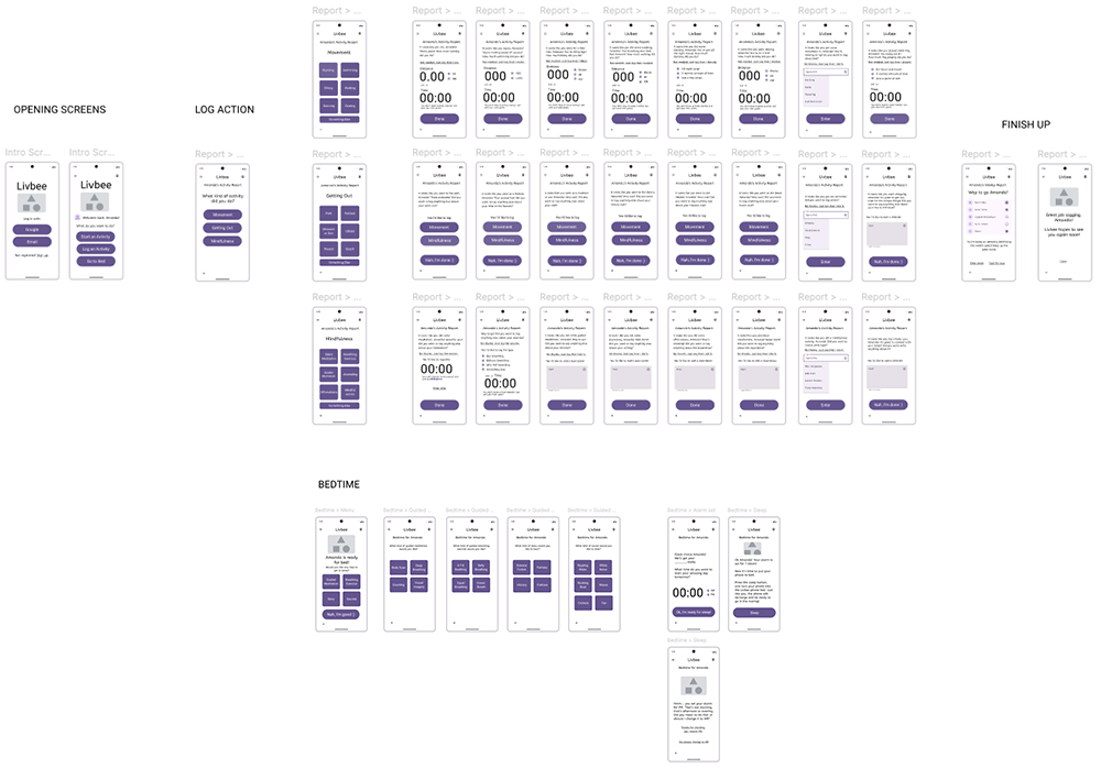
Wireframes were created for each screen of the app, then made it interactive for the prototype.
Livbee UI Design
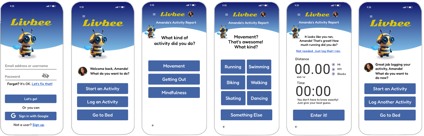
User interface design is in progress. I'm designing iteratively, focusing on one path at a time.
UX & UI FOR ILLINOIS FARM BUREAU
Phase 1: Research & Recommendations
The process began with surveys distributed to the IFB stakeholders and employees. From there we participated in workshops where we dug deeper into the surveys and demonstrated some possible solutions to hear their feedback.
I analyzed what the actual needs were in terms of the site’s audience and the goals for action that IFB wanted the users to take. One thing that became clear during this phase is that the current site provides information. IFB needed a site that encouraged action.

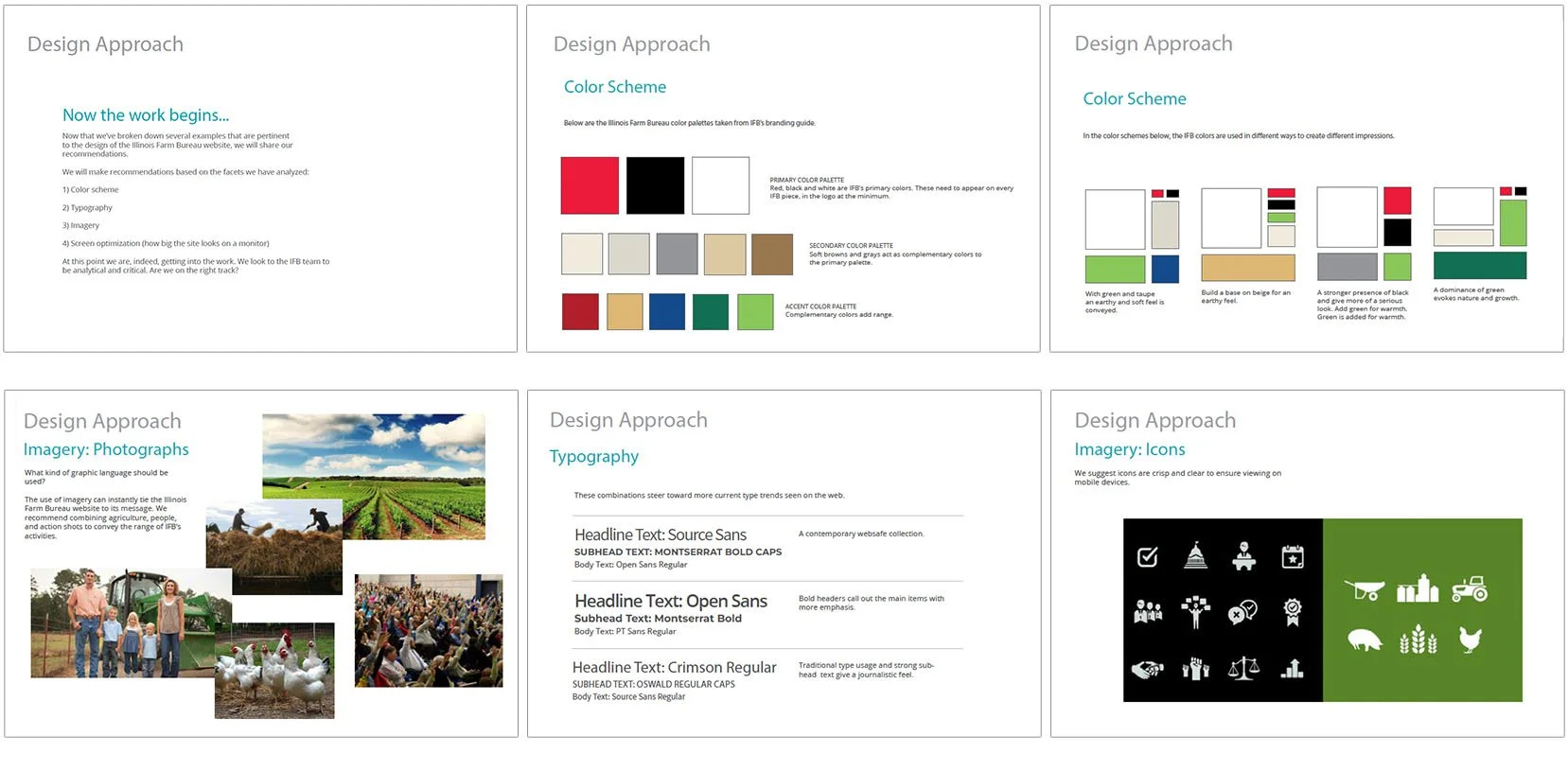
From there I researched other sites in the field and analyzed them in terms of design features such as color scheme, typography, and graphic language.
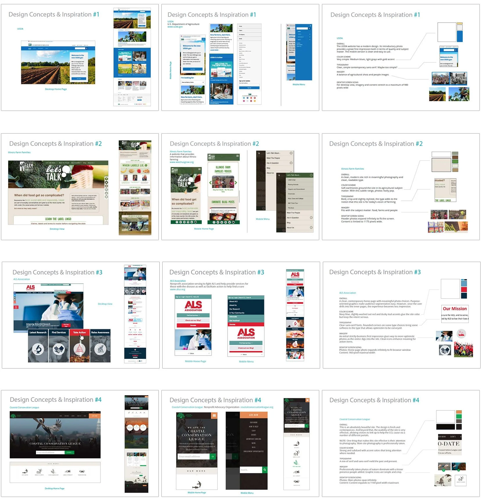
After the research, I began to make recommendations in terms of design facets such as color scheme, typography, and visual tone.
Phase 2: Information Architecture and User Experience Design

The first step in building the structure of the website was to tear down the old site map and start from scratch. I made sure the team agreed that as a site whose purpose was to encourage action, we wanted to incorporate dynamic language. Terms like “Get Involved” and “Take Action” became top-level navigation categories, setting a tone for the website messaging.
From there I created wireframes for all key page templates using Figma.

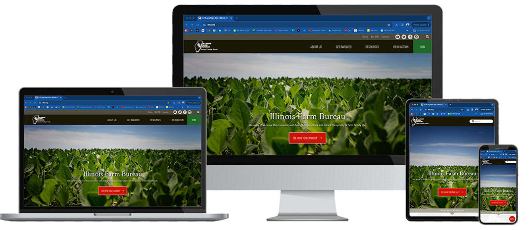
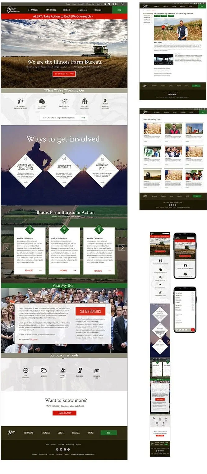
Phase 3: User Interface Design
In the User Interface Design Phase we used photography and a bold color scheme to give a strong first impression, encourage action, and appeal to the concerns of the Illinois Farm Bureau audience members. After creating the layouts, I supervised the development team to ensure it was implemented as designed.
A happy client!
This project was bid as a fixed bid design and discovery project, which ended with the completion of the user interface designs. The Illinois Farm Bureau team was pleased enough with our work together to hire our team to perform the implementation of the project.